A new casual burger joint whose biggest challenge: how to stand out in a saturated market?
Brand Design
illustration
Menu design
apparel design
Content creation
The initial brand workshop illuminated the importance to the founders of family and community, and of serving quality food.
To overcome the connotations of unhealthy and low-quality and be seen as fast casual rather than fast food, we knew we had to talk to moms.

When it comes to household decisions regarding children and food, moms are more often the decision-makers. "Clean" and "simple" were critical to the identity, as we wanted to convey a clean environment and simple, high-quality, tasty food.


Using the custom alphabet and illustrations makes the Community Burger menu easy to navigate and focused color blocks cue customers to the main features: burgers and cocktails.

Front of Menu: Food!
Back of Menu: Drinks & Shakes

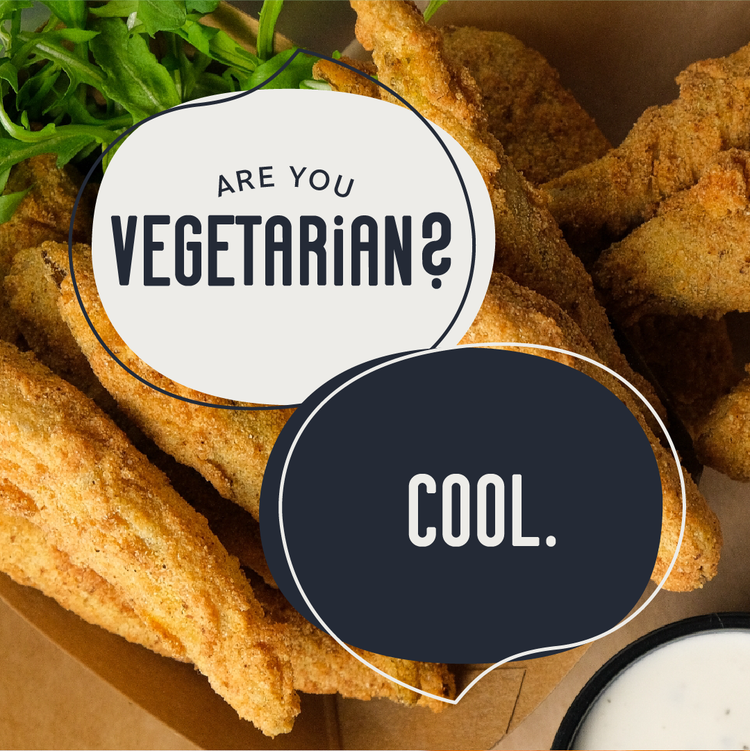
People eat with their eyes before their mouths. Regular, quality social content is crucial. (I had a lot of fun with this).


The initial 9-grid was designed as a destination for customers during the grand opening campaign. Additional headers were created business pages.

T-shirts, trucker hats and beanies designed for both the staff and regulars.


Takeaways, giveaways and merch! Oh my!


Community Burger attended job fair events in the lead up to opening. These were created to tell the story of Community Burger; Who, When and What.

We're Hiring retractable banner

Coming Soon retractable banner
Love Your Community retractable banner

Serve Your Community retractable banner
